An Unrecorded De La Rue Variety?
The 1935 Silver Jubilee of the reign of King George V (whose Coronation was held on this day in 1911), was commemorated by a series of stamps with common design. My earlier blog regarding the series can be found here.
The stamps were printed in a two-part process (except for Newfoundland), with a frame plate and a vignette. Unique varieties exist for all three printers. There are superb reference sites here and here that show all of the major, and many of the minor varieties.
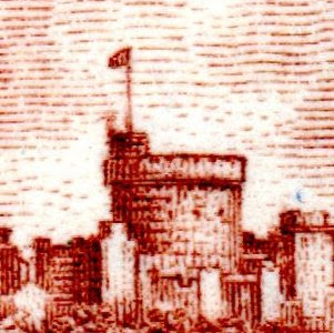
I recently found three stamps printed by De La Rue that seem to show a common variety, in three different stages, for which I've found no other reference.
The stamp that shows the flaw most prominently is the Northern Rhodesia 6d (SG21). The flaw takes the form of a large bird, or a reversed tick-mark, on the left edge of the Round Tower
The Antigua 2½d (SG93) appears to show the same flaw, apparently after an attempted re-touch
The last example I have is British Solomon Islands 1/- (SG56) which seems to show a more advanced stage of retouching
For comparison, of both the position of the flaw, and it's significance, this is a scan of the Bradbury Wilkinson variety "Short extra flagstaff" taken from the SG catalogue
This may or may not be a new variety, however I haven't been able to locate a reference to it in my usual resources. I'd be very interested to hear from anyone who locates anything in the same position on the Round Tower on the De La Rue printings. Scans would be very much appreciated as well.
UPDATE - Tony Ainscough from www.silverjubileestamps.com has reviewed the finding and states that he hasn't previously seen this flaw. It will be shown on his website for discussion and, hopefully, confirmation of sheet position. I'd like to thank Tony for his feedback
UPDATE - Tony Ainscough from www.silverjubileestamps.com has reviewed the finding and states that he hasn't previously seen this flaw. It will be shown on his website for discussion and, hopefully, confirmation of sheet position. I'd like to thank Tony for his feedback


Might be worth dropping a note with a link to this blog entry to the King George V Silver Jubilee Study Circle http://www.philatel2.com/jubilee/index.htm or to the author of "Silver Jubilee of King George V; Stamps Handbook" A. J. Ainscough http://www.silverjubileestamps.com/
ReplyDeleteGreat minds think alike! I've emailed both, and I'll be happy to get a reply. I'll do a blog update if I hear anything back
ReplyDeleteBeautiful pictures and excellent explanations. You are a credit to philately!
ReplyDeleteThank you for the kind words Smauggie, they make writing worthwhile!
Deletecould someone advise me as to why the Newfoundland set was only in one color?
ReplyDeleteCB
Apparently it was nothing more than a cost-saving exercise by Newfoundland. Each colony released four stamps of denominations in frequent use. The values issued were chosen according to specific criteria. One stamp had to be the usual inland letter rate, the second a denomination equal to or below 6d in value, the third the foreign letter rate, and one other a shilling of the local equivalent.
ReplyDeleteThere was no instruction regarding monocolour or bi-colour. As the Newfoundland stamps were printed in one process, there are no recognised varieties on them
Thanks for the fast reply.
ReplyDeleteI suspect the same thing as you have suggested. The reason I asked was because I found the following statements related to this issue on another site which suggests it was 'understood' in the draft tender that they would be in two colors. I have copied it below with the site identified. Any further thoughts? I suspect Newfoundland just ignored that aspect since she was bankrupt at the time.
August 24, 1934 Circular letter sent to the various Colonies notifying them of the approval of the issue which would be limited to four denominations These were a) shilling or local equivalent, b) inland letter rate, c) foreign letter rate and d) one other denomination not exceeding six pence.
It was agreed that three companies (Bradbury, De la Rue and Waterlow) would be involved in printing the stamps. It was agreed amongst the three that the firm producing the winning design would lead the contract. A draft tender was drawn up which included details of the basic printing process and indicating that the stamps would be bi-coloured
http://www.philatel2.com/jubilee/id254.htm
Thanks for your comments, they're very much appreciated.
DeleteThe site you mention is, without doubt, the best online resource for the Jubilee series.
"Indicating that the stamps would be bi-coloured" is the relevant point. There was no firm instruction. As each colony paid for their stamps, Newfoundland's bankruptcy is very relevant
The fact that each colony paid for its own stamps is significant for sure. Thanks for all this. It was a pleasure to chat about this with you.
ReplyDeleteCB
Nice to chat with you as well!
ReplyDeleteIf you'd like to chat in real time, why not join us at the Internet Philatelic Dealers Association (IPDA) Chat Room? http://www.ipdastamps.org/PublicChat.php I'm a Director of the IPDA, and the chat room attracts dealers and collectors alike. It's informal, and no registration is required. I'm in there right now
Can anybody direct me to the photograph that was used for the George V Jubilee Omnibus stamps. The shot of the castle from the river. I have searched online quite a bit but have come up empty.
ReplyDeleteCB
Cliff
Mercer PA USA
Hi Cliff, I can't help I'm afraid. Anyone else?
ReplyDelete